How to predict abstention rates with open data
This post was written in collaboration with Alexandre Vallette who's my co-author on an upcoming guide to hacking with open data (scroll down to find out more).
Open data is a way to increase transparency into what happens in our society. When coupled with predictive modelling, it becomes a way to interpret why things happened. Even though it sounds complex, these techniques have become accessible to the masses. Let's see how this works with elections data.
It's all about the context
Let's say you're given abstention rates for every township in an election. You can create a heat map to visually identify regions of high/low rates.
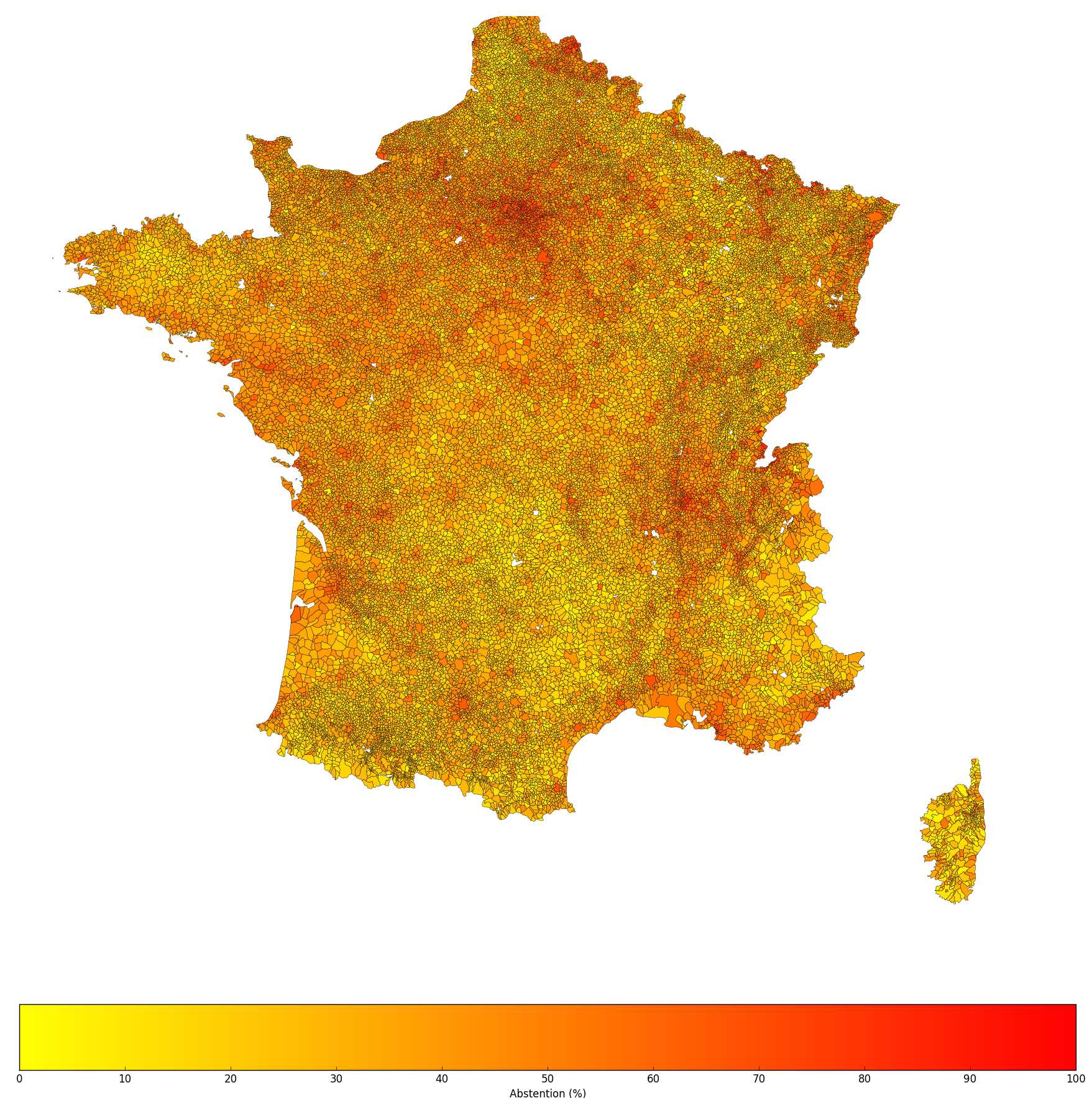
Heat map of the abstention rate for the 2008 mayoral elections in France, courtesy of Snips / Alexandre Vallette
On election night, everyone has their own interpretation of why rates were higher or lower than average in certain places. But these are only speculations — they are not based on facts that have been measured. What if you could use machines to crunch all the open data that's available in order to find patterns across the townships where abstention rates are high/low?
As a first step to do that, Alexandre Vallette showed how you could enrich elections data by merging different sources of open data into a representation of the "context" of each township, with information such as population, hourly salary, number of people living in social housings, etc. Alexandre then applies machine learning to create a model of the relationship between context and abstention rate. This model can be used to make predictions for future elections, or to estimate how slight changes in a given context could impact the outcome (the abstention rate). He implemented this idea on French mayoral elections, but his method can be adapted to any other election anywhere else. The data he used for the 37586 French communes can be downloaded here (35.2 MB, gzipped CSV file).
Predictive models made easy
In this post, I want to show you two more things:
- If you use descriptive predictive models such as decision trees, you can see how predictions are made as sequences of rules. For instance: IF (hourly salary > 9.78) AND (number of people in social housings > 1118) AND (region = ile-de-france) THEN (abstention = 65.61%).
- Anyone can create such models with services like BigML that abstract away the technical complexities of predictive modelling. All it takes is to upload data to the service and to select the target to predict (here, the abstention rate).
Below is a "SunBurst" visualization of the model I built with BigML, using the same data as Alexandre (click on ‘View on BigML’ to see a bigger version).
How to read the SunBurst visualization:
- Each arc corresponds to a set of townships that satisfy certain conditions — hover your mouse over a few of these arcs to see examples.
- The color of the arc reflects the average predicted abstention rate for the corresponding set of townships.
- Arcs are split into sub-arcs, representing subsets, as you move away from the center.
- The number of degrees spanned by an arc is proportional to the number of townships found in the data that belong to the corresponding set.
Note that this model is just one way to interpret the data and to present the correlations that were found. Even though we are dealing with a rule-based model, bear in mind that the "features" used in the rules to characterize townships are not necessarily causes of abstention. Correlation does not imply causation — if you take the example of sunglasses and ice-cream, their sales are correlated but one does not cause the other.
Some more details
Actually, I did something a tiny bit more sophisticated than just uploading the data to BigML. I uploaded the data to create a first model, and BigML showed me the 10 most important context features to predict abstention. To make the data smaller and the model simpler, I then removed the other features (there were 930 of them originally) and I built a new model based on this selection of 10 features ('hourly salary', 'population', 'latitude', 'people in social housings', 'region', 'registered', 'people age 0-14', 'households w. people in intermediate occupations', 'farmers', 'households with individual electrical heating'). The data shrunk from 176.5 MB to 2.5 MB (download it here). As a comparison, when you replicate Nate Silver's 538 Election Forecasting Model (US 2012 presidential elections), you get a dataset of only 188 KB.
How accurate is the model?
To evaluate the accuracy of the model, I did an 80-20% split of the data. The first part was used to build a model, the second one was used to make predictions and to compare them to the true — withheld — abstention values. On average, there was a difference of 7.52 points between predicted and actual abstention rates. With an R-squared value of 0.5 (the maximum being 1 and the baseline 0), the model works reasonably well.
If you're interested in finding out more about how the data was assembled, check out Alex's source code on Github.
Enjoyed this article? Vote on Hacker News and follow me!